Your dashboard, explained
Every number on your dashboard comes straight from your own uploaded sessions — no guessing, no estimates. Here's what each card and chart is actually telling you.
The 5 KPI cards
The top row is your whole poker life at a glance, filtered to whatever date range you've set above it.

Sessions
Total games you've uploaded. Each session is one PokerNow game.
Hands
Every individual hand dealt across all sessions. More hands = more reliable stats.
Net P/L
Your total profit or loss. Red means you're down, green means you're up.
Avg/Session
Your average result per session — is a bad night an outlier or a trend?
Win Rate
Percentage of sessions where you finished positive. 50%+ means you're winning more often than not.
The three trend charts
Below the KPI row: Results Over Time (your cumulative $ line, session by session), Win Rate (BB/Hand) (are you winning more per hand lately, or less?), and Session Distribution (a histogram of how your results cluster — mostly small wins, or a few big swings?). All three read the same filtered date range as the KPI cards above them.
Bad Beats Scoreboard
PXF automatically detects bad beats — hands where you were a big favorite (65%+ equity) and lost anyway, or where you delivered one to somebody else. No tagging required; it's computed from every hand you upload.
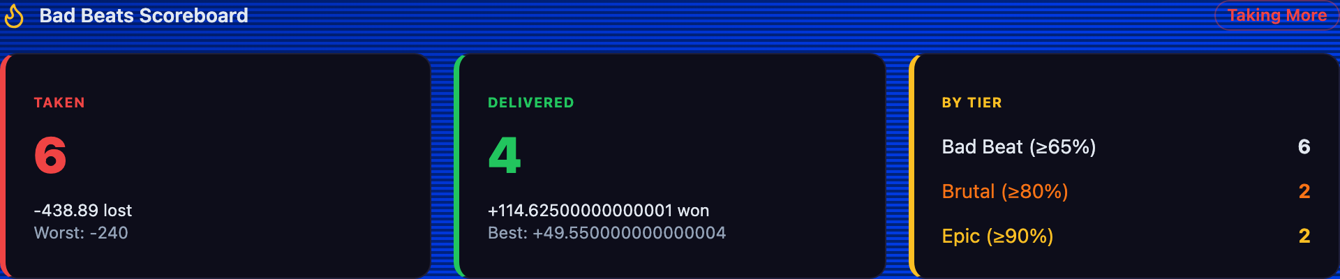
Taken
Bad beats YOU took — you were the favorite and lost. Shows the count and your worst one.
Delivered
Bad beats YOU handed out — somebody else was the favorite. Your best one is bragging rights.
By Tier
How bad, exactly: Bad Beat (≥65% equity), Brutal (≥80%), Epic (≥90%) — the worse the odds, the higher the tier.
A few things to know
- ·Every $ figure depends on your chip rate. If your Net P/L looks 10× or 100× off, check your chip rate first — the dashboard doesn't invent chips, it only converts them.
- ·The date filter (top of the page) scopes everything below it — KPIs, charts, and the Bad Beats Scoreboard all recalculate together when you change it.
- ·Tournaments get their own P/L line — tournament chip stacks aren't real money, so they don't mix into your cash Net P/L.
Last updated July 1, 2026